Material Design is a design language created by Google to encourage developers to implement cohesive and attractive UIs. Material Design relies on a number of guiding principles, as well as specific building blocks called Material Design components.
This approach to UI is utilized across most of Google’s own apps and tools but is also found in many other Android apps and even websites.
If you are an Android developer, having at least a passing understanding of Material Design can go a long way to giving your app that professional sheen that resonates with users. Fortunately, it is now easier than ever to implement Material Design components.
But should you?
The rules of Material Design
If you want to learn the “rules” of Material Design, check out Google’s own Guidelines.
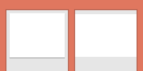
Generally, everything in a Material Design app should represent physical “materials” and interactions. Elements should appear as though they are on a physical surface. Usually, this is flat card and paper. Theses “materials” should utilize shadows and movement as the user expects.
Pop-up windows have shadows. This is also used to communicate hierarchy (by letting you see at a glance what is “on top”).

This is “paper abstraction.”
Animations should utilize ease-in and ease-out and other techniques to create more natural movement. A lot of importance is placed on movement in fact. Generally, the user should feel as though they are static and the interface is moving around them rather than the other way around. Movement can once again convey importance, meaning, and order.
Material Design is big and bold: it utilizes block colors that are often contrasting. Everything should be easy-to-follow, which means bold headings and big, touch-friendly buttons. Google uses a lot of the Roboto font, but this is by no-means a rule!
Be “bold, graphic, and intentional.”
Material Design is big and bold.
Material design is minimalistic. Every element on the screen should serve a specific purpose, which means no overly-designed backgroudns. These only serve to confuse the user and create visual clutter.
Finally, developers should utilize common Material Design components like the floating action button (FAB) and “cards.” These help users quickly get to grips with navigation.
Material Design 2
A few years ago, Google chose to build on the foundations it lay with its Material Design. It did this by bringing us an update to its guidelines. This newer iteration was dubbed by much of the internet as “Material Design 2.” It wasn’t universally applauded!

One reason for this move was that during the early days of Material Design, there were no ready-made Material Design components for designers to turn to. This resulted in a lot of different interpretations of Google’s ideas with mixed results.
Moreover, Material Design was initially very limited to its implementation on the Android platform. The aim of this “refresh” was to make Material Design more “platform agnostic.” Keen-eyed users began to see the changes pop up across Google’s products.
The point of MD2 was never to introduce new “rules” or any drastic change in direction. However, developers have noted an increased use of rounded corners, white space, and Google Sans. This, of course, is where the controversy lay!
Is Material Design a force for good?
Before you start implementing Material Design components and themes in your own apps, you might ask if this is even a good idea.
There are arguments for and against, as ever.
Why Material Design is a good thing
Material Design encourages sensible design trends and decisions that help to provide a more frictionless experience across mobile apps and the web. It also provides a useful framework for developers with no design theory of their own.
This creates the impression of one seamless flow between complementary services.
Android users particularly benefit from this coherent visual language; especially as they jump between apps to share files and chat to friends. Rather than the jarring experience of going from one UI to something completely different when selecting a photo; this instead creates the impression of one seamless flow between complementary services.
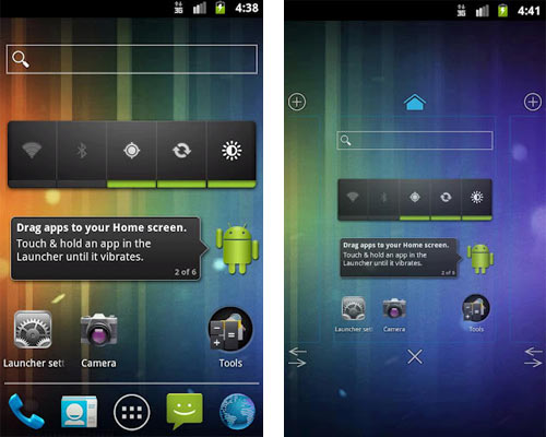
More importantly: Material Design puts a stop to terrible design decisions. Like the ugly use of skeuomorphism (icons that are designed like 3D representations of their physical counterparts – think little pictures of phones and cameras), overly-saturated colors, and the old “holo” look from Android’s past. Anyone remember this:

Thanks to the (now consistent) Material Design components provided to developers, users can generally rely on finding certain navigation elements in consistent locations. These include floating action buttons in the bottom right, and hamburger menus in the top left. That sure beats spending hours learning each new layout.
Material Design apps area also typically light on resources and quick to load thanks to the reliance on block colors and flat images.
The dark side of Material Design
While these aspects of Material Design have improved the user experience across much of Android, there are downsides to the push toward Google’s singular vision.
Material Design promotes the homogenization of apps.
Material Design promotes the homogenization of apps and services across the Android ecosystem and the web. This reduces the unique impact of company branding and prevents apps from standing out.
Google goes some way to combat this with “Material Design Theming” tools. These apply global changes as you tweak specific aspects of your UI such as color and typography. However, this is still limited in scope and ultimately results in variations of the card-based, high-contrast design that Google is pedalling.
And due to the high number of apps available on both Android and iOS, this can mean a lot of extra work for developers. That said, lot of Google-themed apps still end up on the App Store.
This also hurts the user. Finding an app with a truly unique interface or surprising animation can be a great experience. Google claims it offers “guidelines, not rules” and many interpreted the changes brought with Material Design “2” this way. But there is no denying that Material Design apps have a certain “look” and prescriptive behavior.
No accounting for taste
All of this applies doubly if you don’t like Material Design. While good design follows a number of inarguable rules, it is also subjective.
I am not a big fan of Material Design. In particular, I dislike Google’s use of color in some instances (especially the new Gmail icon!). Likewise, I find Google Calendar on Android anything but intuitive. And yeah, I like my technology to feel “high tech.” There’s no accounting for taste, eh?

But, so successful is Material Design, that developers who opt to go against the advice will often end up looking out-of-touch and even outdated.
Your job as a developer is to find the right balance. To employ Material Design and Material Design Components where appropriate, while still finding your own style. To some extent, that’s going to depend on the type of app you are creating. This matters far less for game developers, for example.
How to implement Material Design Components
So, how do you go about creating an app that conforms to the Material Design language and behaves as users expect?
The good news is that this is easier than ever. The templates offered in the New Project dialogue use Material Design Components by default and will automatically match the latest themes and style advice from Google. In Android Studio 4.1, this was updated to reflect the changes that came with Material Design 2.

This brings some extra boilerplate of course, but thankfully it’s all simple enough to understand and comes ready-commented.
See also: Getting started with the new Motion Editor in Android Studio 4.0
From there, it’s important to consider Google’s guidelines and how you are going to interpret them. Many views exist to help make this easier and are worth getting to grips with. Fragments for example, are brilliant for keeping the user in one place. Likewise, Cardview and RecyclerView are inherently “Material Design-ey.” Fragments are views that can contain entire layouts and come with their own accompanying Java code. Fragments act as their own mini-apps within the broader context your main activity, allowing you to bring more information to the user.
See also: How to use fragments in your Android app for a powerful and dynamic UI
Android Studio 4.0 previously brought us the “Motion Editor,” which makes it much easier to design motion layouts with effective use of movement. Jetpack Compose is likewise meant to streamline the creation of new UIs. Although as ever, Google does have a habit of throwing a bit too much our way. Start with your design, and work backwards to find out what you need to learn.
Spend some time researching Google’s other apps. Question the purpose behind every design decision (communicate, don’t decorate!). Aim for “paper abstraction.”
And if all else fails: hire a designer!
source https://www.androidauthority.com/material-design-components-1177515/

Comments
Post a Comment